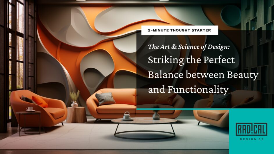
The Art & Science of Design: Striking the Perfect Balance between Beauty and Functionality
Unlock the balance between stunning visuals & user-friendly design. Dive into how Radical Design Co. creates harmonious designs that captivate while remaining functional. Discover the art & science of design: beauty meets functionality.
In the design world, a familiar yet intricate tug of war exists between aesthetics (Visual Design, VD) and usability (User Experience, UX). On one end of the spectrum, we have stunning designs that can be challenging to use; on the other, highly functional but lackluster designs. However, does it need to be a binary choice? Must one aspect bow to the other? There is a balance where both can thrive, intertwining beauty with function.
Products should be a strategic union of VD and UX that forms a successful, compelling, and functional experience to be most successful. Here is our perspective on achieving this beautiful balance:
-
Beauty in Simplicity
Simple designs are often the most effective, coupling functionality with an aesthetic appeal. They are user-friendly, and intuitive and significantly enhance the user experience. They ensure users can navigate a product easily while enjoying its visual appeal. Apple’s website exemplifies a harmonious blend of visual beauty and functionality, creating an experience that’s both aesthetically pleasing and user-friendly.
Gestalt Theory in Action: The website’s design leverages the Gestalt Theory’s emphasis on simplicity. By avoiding clutter, it presents content and products in a way that the user perceives as a cohesive and streamlined experience, enhancing the overall ease of navigation and visual appeal.
Applying the KISS Principle: The intuitive navigation of Apple’s website is a testament to the KISS Principle. It strips away unnecessary complexity, making the user journey straightforward and efficient. This approach enhances user satisfaction and reinforces the brand’s ethos of simplicity and elegance in design.
-
Purposeful Aesthetics
Aesthetics should not be an afterthought but must serve a purpose. Beautiful design elements can guide users through a digital journey, highlighting the crucial touchpoints and making the overall experience both satisfying and functional. Spotify’s user interface is a masterclass combining aesthetics with functionality, ensuring that every design element is appealing and purposeful.
Aesthetic-Usability Effect: Spotify’s vibrant and dynamic design leverages the Aesthetic-Usability Effect. This design strategy makes the app visually engaging and perceived as more intuitive and easy to navigate.
Affordance Theory at Play: Using color and visual cues in Spotify’s interface exemplifies Affordance Theory. Each design element is crafted to be easily interpretable by users, guiding their interactions and making the overall experience more enjoyable and efficient.
-
Usability as a Design Element
Usability isn’t just about function; it’s a crucial design component. It’s about creating a satisfying, engaging, and easy-to-use experience. It enhances the visual design, making the product more attractive to users. Amazon’s ‘Add to Cart’ button is a perfect example of how visual elements can enhance usability, aligning with crucial UX principles for an optimal user experience.
Fitts’s Law Implementation: The button’s design directly applies to Fitts’s Law. Its size and prominent placement reduce the cognitive and physical effort users require to perform one of the site’s most crucial actions: adding to the cart.
Heuristic Usability: The design aligns with critical usability heuristics, particularly regarding user control and freedom. It makes the purchasing process more intuitive and error-proof, enhancing the overall user experience on the platform.
-
Content-Specific Design
The type of content dramatically influences the interplay between beauty and functionality in design strategy. For content-specific design, understanding your audience and content type allows you to strike the right balance between aesthetics and usability, ensuring neither aspect overshadows the other and creates a coherent, captivating user experience. The National Institute on Aging’s website demonstrates how design can be tailored to meet specific audience needs while maintaining aesthetic appeal and functionality.
Principle of Relevance: The site’s use of large fonts and high-contrast colors is a thoughtful application of the design principle of relevance. It specifically caters to the needs of its primary audience, older users, making the content easily readable and the user experience more comfortable.
UX Principle of Accessibility: These design decisions are firmly rooted in UX accessibility principles. By considering users with varied visual abilities, the website becomes a model for inclusive design, ensuring that information is accessible to all, including those with visual impairments, enhancing the site’s usability and effectiveness.
At Radical Design Co., we specialize in this harmonious blending, creating design strategies that resonate with your brand and its users. We work towards a seamless union of UX and VD, creating solutions that captivate and facilitate in equal measure.
Intrigued?
More Thought Starters

Thought Starters
Let AI Supercharge Your Workplace Without Losing the Human

Thought Starters
Unlocking Innovative Design Strategy: 8 Mental Models to Transform Different User Experience Needs

Thought Starters